
As a dentist or dental practice owner, you know that attracting new patients and retaining existing ones is crucial for your practice’s success. Your website plays a significant role in achieving these goals, as it’s often the first point of contact between your practice and potential patients. Research shows that 77% of patients use search engines like Google to find healthcare providers, emphasizing the importance of a well-designed and user-friendly dental website.
This guide, “Dental Website User Experience,” is designed to help you understand and improve your dental website’s user experience (UX). By following the best practices and avoiding common mistakes outlined in this guide, you’ll create a dental website that is not only visually appealing but also effective in converting visitors into patients.
In the following sections, we will dive into the key components of dental website UX, discuss common mistakes to avoid, share best practices, and provide real-world examples through case studies. We will also address frequently asked questions and show you how partnering with Prosites can elevate your dental website’s UX.

User experience, or UX, is all about how people interact with and feel when using your dental website. It’s the overall impression visitors get when they visit your site. Good UX means your website is easy to navigate, visually appealing, and informative, making users want to explore more and ultimately choose your dental practice.
The importance of UX in dental websites can’t be overstated. A positive user experience is crucial for attracting new patients and retaining current ones. When potential patients visit your site, they’re evaluating whether they can trust your practice for their dental needs.
According to a study, 92% of consumers trust recommendations from others, even people they don’t know, over branded content. This means that a well-designed website that offers a great user experience can lead to more positive reviews and word-of-mouth referrals.
By understanding the importance of UX for dental websites and taking steps to improve it, you’ll create an online presence that attracts new patients, keeps existing ones happy, and sets your practice up for long-term success.

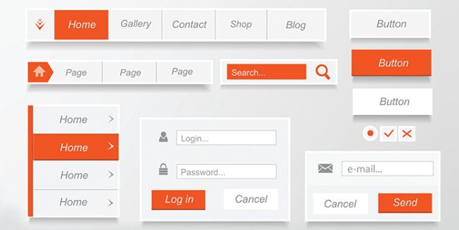
Creating a user-friendly dental website involves focusing on four main components: navigation and structure, content and readability, visual design, and responsiveness and accessibility. By addressing these aspects, you’ll provide a seamless experience that keeps visitors engaged and helps them find the information they need.
A well-organized website is crucial for guiding users through the various sections and helping them find what they’re looking for quickly. To optimize your dental website’s navigation and structure, follow these steps:
Example: Mayo Clinic’s website has an easy-to-navigate menu with clear labels, making it simple for users to find information.

Your dental website’s content should be informative, easy to understand, and engaging. Follow these steps to improve content and readability:
Example: The American Dental Association’s MouthHealthy website provides easy-to-read information on various dental topics.

A visually appealing website creates a positive first impression and keeps visitors engaged. To enhance your dental website’s visual design, follow these steps:
Example: Dentistry at East Piedmont’s website showcases a clean, modern design with high-quality images.
Your dental website should be accessible and responsive on all devices, including smartphones and tablets. Follow these steps to ensure responsiveness and accessibility:
By focusing on these key components, you’ll create a dental website that offers an exceptional user experience, making it easier for potential patients to find and trust your practice.
In your quest to create a user-friendly dental website, it’s essential to avoid some common UX mistakes. By steering clear of these pitfalls, you’ll provide a better experience for your visitors and improve your chances of attracting new patients.

A cluttered layout can make your dental website difficult to navigate and overwhelming for users. To avoid this mistake, follow these steps:

Having clear, compelling calls to action (CTAs) is crucial for guiding users to take the desired action, like booking an appointment. To optimize your CTAs, follow these steps:
Example: Aspen Dental’s website features a clear, prominent CTA encouraging users to schedule appointments.

Slow-loading pages can frustrate users and lead to higher bounce rates. A study found that 53% of mobile users abandon a website if it takes longer than 3 seconds to load. To improve your website’s loading speed, follow these steps:
Example: Google’s PageSpeed Insights tool can help you identify and fix slow-loading pages.
Making your website accessible to all users, including those with disabilities, is essential for providing a great user experience. To ensure your website is accessible, follow these steps:
Example: The Web Content Accessibility Guidelines (WCAG) offer comprehensive guidance for making your website accessible to all users.
By avoiding these common UX mistakes, you’ll create a dental website that’s easy to navigate, visually appealing, and accessible, ensuring a positive experience for all visitors.

Implementing best practices for dental website UX can help create a more enjoyable experience for your users, leading to increased patient satisfaction and loyalty. By focusing on simplified navigation, consistent branding, relevant content, and responsive design, you’ll set your dental practice up for success.
An easy-to-use navigation system helps users find what they’re looking for quickly. To create simplified navigation, follow these steps:
Example: Colgate’s Oral Care Center offers a simple navigation menu with clear labels, making it user-friendly.
Maintaining a consistent look and feel across your website builds trust and reinforces your dental practice’s identity. To achieve consistent branding and design, follow these steps:
Example: Mint Dentistry’s website features a consistent color scheme, typography, and layout, creating a cohesive user experience.
Engaging, informative content is crucial for educating users and encouraging them to choose your dental practice. To create relevant, easy-to-understand content, follow these steps:
Example: Delta Dental’s website provides informative, easy-to-read content that addresses common dental concerns.
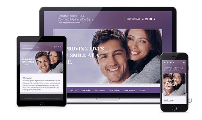
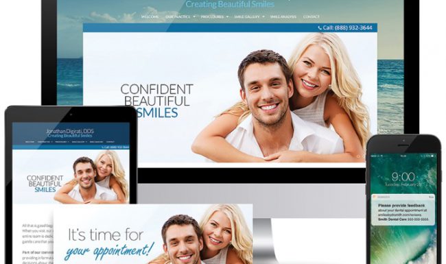
A responsive design ensures your website looks and functions well on all devices, including smartphones and tablets. To implement a responsive design, follow these steps:
By following these best practices, you’ll create a dental website that offers a positive user experience, helping you attract and retain more patients for your practice.

Understanding the strengths and weaknesses of your dental website’s user experience is essential for making improvements. In this section, we’ll discuss tools and methods for evaluating your website and identifying areas that need enhancement.
There are several ways to assess your dental website’s UX. Here’s a step-by-step guide to some popular tools and methods:
Example: A dental practice might discover through Google Analytics that users are leaving their website after visiting the “Services” page. This could indicate that the content is unclear or not compelling enough.
After evaluating your website using the tools and methods above, focus on areas that require attention. Here are some steps to help you pinpoint these areas:
Example: If your heatmap data shows that users aren’t clicking on your “Schedule Appointment” CTA, you might redesign the button to be more prominent or change its wording to be more enticing.
By assessing your dental website’s UX and identifying areas for improvement, you’ll be well on your way to creating a more effective and user-friendly online presence for your practice.
Now that you know how to assess your dental website’s UX and identify areas for improvement, it’s time to create a plan and implement changes. Here’s a step-by-step guide to help you enhance your dental website’s user experience.
Example: If your goal is to improve the readability of your website’s content, you might prioritize tasks like rewriting confusing content, updating font sizes, and ensuring proper text formatting.
Example: After making changes to your website’s content, keep an eye on metrics like time spent on pages and bounce rates. If you see positive improvements, continue refining your content and implementing best practices.
By following this step-by-step guide to improving your dental website’s UX, you’ll create an online presence that engages your visitors, increases appointment bookings, and helps your dental practice thrive.

We understand that dental website UX can be a confusing topic, especially for those who are new to the concept. In this section, we’ll address some common concerns and misconceptions by answering frequently asked questions about dental website UX.
A: UX (User Experience) refers to the overall experience a user has while interacting with a website, focusing on aspects like usability, accessibility, and satisfaction. UI (User Interface) is a subset of UX and involves the visual and interactive elements of a website, such as buttons, menus, and typography. In short, UX is the big picture, while UI focuses on the individual components that make up that experience.
A: Absolutely! Many UX improvements can be made without undertaking a full redesign. Simple changes, like adjusting your website’s navigation, improving content readability, and optimizing calls to action, can significantly impact your website’s UX. However, if your website has numerous issues or is outdated, a complete redesign might be more beneficial.
A: Some key indicators of good UX include low bounce rates, high conversion rates (e.g., online appointment bookings), and positive user feedback. To assess your website’s UX, use tools like Google Analytics, heatmaps, and user testing to gather data and pinpoint areas that need improvement.
A: Regularly reviewing and updating your website’s UX is essential for keeping it optimized and user-friendly. As a general rule, you should assess your website’s UX at least once a year. However, it’s a good idea to monitor your website’s performance and user feedback continuously to make adjustments as needed.
By addressing these common concerns and misconceptions, we hope to help you better understand the importance of dental website UX and the steps you can take to enhance your online presence.

As we wrap up this guide on dental website UX, let’s take a moment to recap the key points we’ve covered. By keeping these in mind, you’ll be well on your way to creating a user-friendly and engaging dental website that attracts new patients and keeps existing ones coming back.
Remember, creating an exceptional user experience for your dental website is an ongoing process. As technology and user preferences evolve, so should your website.
If you need help or guidance in improving your dental website’s UX, don’t hesitate to reach out to us at Prosites. Our team of experienced professionals is here to assist you in creating a website that not only looks great but also performs well in terms of user experience. With our expertise, you can focus on providing top-notch dental care while we take care of your online presence.

ProSites Headquarters
38977 Sky Canyon Drive,
2nd Floor
Murrieta, CA 92563
(888) 932-3644